

Rooted in Tradition
The branding for Torta de Elote was designed to honor both the product and Ana Maria Herrera’s roots. We chose a western-style font to reflect the southern, more desert region of Mexico where she comes from, grounding the brand in heritage.
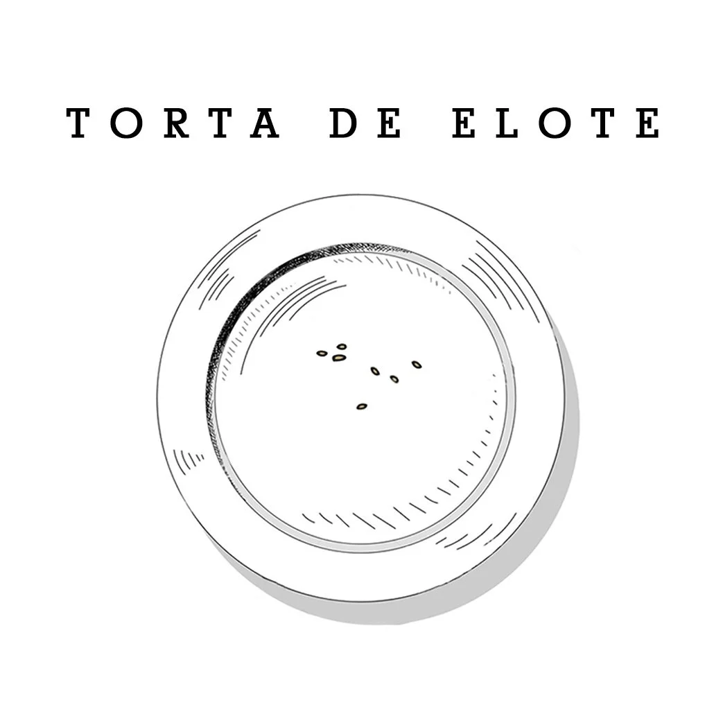
For the central logo icon, we hand-sketched a plate, scanned it digitally, and added a few crumbs of the family’s yellow cornbread in Photoshop to keep the texture consistent with the drawn style. This small detail tied the logo directly to the product, making the brand both personal and memorable, and giving Torta de Elote a distinct identity that stood out in the local market.